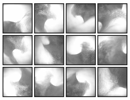
I’ve got what I think is a first draft of my Victor grid. The lower right quarter doesn’t feel quite resolved yet, but I thought I’d post the piece in progress and see what your thoughts are. If you have any, let me know. (Keep in mind that the tones will be quite different in the printed piece—we’re just looking at composition today.)

I’ve also come up with an idea for Tim, but it’s so unlike anything I’ve ever done, that I have to sit on the idea for a few more days before I solicit any feedback. Stay tuned.
